We’ve worked with Towns since they were a start-up plumbing and heating store and, as they have expanded to include a high-end bathroom showroom, we have evolved their brand to align with their changing audience.
The Challenge
How to align two contrasting target audiences under one brand?
Towns launched their plumbing and heating store ten years ago, with a target audience of trade plumbers and DIY enthusiasts. During the process of designing their logo, I selected a heavy, sans serif font and replaced the letter ‘O’ with a tight swirl to symbolise water going down a plughole. The blue and red colour palette represented hot and cold water in heating. The result was a bold logo which stood out from the numerous plumbing trade counters in Tonbridge and over time, they became established as a reliable supplier of plumbing goods in the area with great customer service.
Fast forward eight years and Towns had successfully expanded to include a luxury bathroom showroom alongside their plumbing and heating store. Whilst in theory this was a harmonious combination, the reality was the juxtaposition of two businesses within the plumbing industry with completely contrasting target audiences. The first challenge was how to maintain both businesses under one brand and market them both successfully? The second challenge was brand awareness, as tucked away on a small industrial estate Towns doesn’t receive passing trade.
Services
Strategy
Branding
Print Campaigns
Print & Distribution Management
Art Direction of Photography
Before
The Design Process
Often when redesigning a logo, evolution not revolution is the most appropriate course of action. This was the case with the Towns rebrand, as it was felt that maintaining brand recognition was important. However, it was also acknowledged that the heavy typography did not visually align with the luxury bathroom products on offer in the showroom as the target audience were affluent homeowners with an appreciation of high-end interior design.
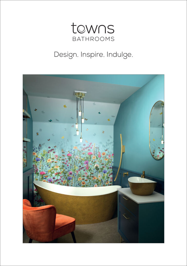
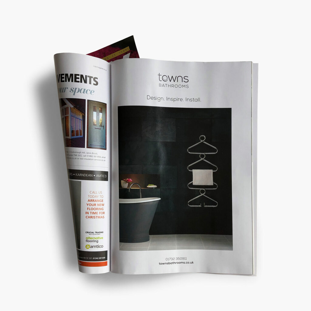
The original Towns logo was evolved by introducing a more sophisticated and delicate typeface, Nexa Light. As the swirling ‘O’ was synonymous with Towns, it was slimmed down to match the weight of the lettering and the small serif on the stem of the ‘n’ was removed to create smooth, uncomplicated typography. A monotone palette of black and white was implemented and the business was separated into Towns Plumbing Store and Towns Bathrooms.
Brand Awareness
In terms of brand awareness, two marketing plans were devised to target the different audiences: local plumbers and luxury homeowners across the region.
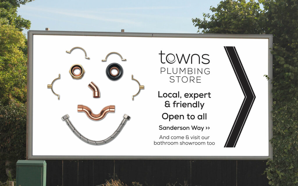
The messaging for Towns Plumbing Store needed to appeal to local plumbers to promote their location and reputation of excellent customer service. The concept of plumbing materials and friendly service were combined resulting the imagery of a face made from plumbing supplies. I art directed the photography, and the resulting imagery has been used on a leaflet door drop campaign within a 3 mile radius of the store, and outdoor advertising on a billboard on the main road past the industrial estate. The concept has been a great success and has been further adapted for a new winter campaign, with ‘plumbing man’ now sporting a woolly hat and scarf.
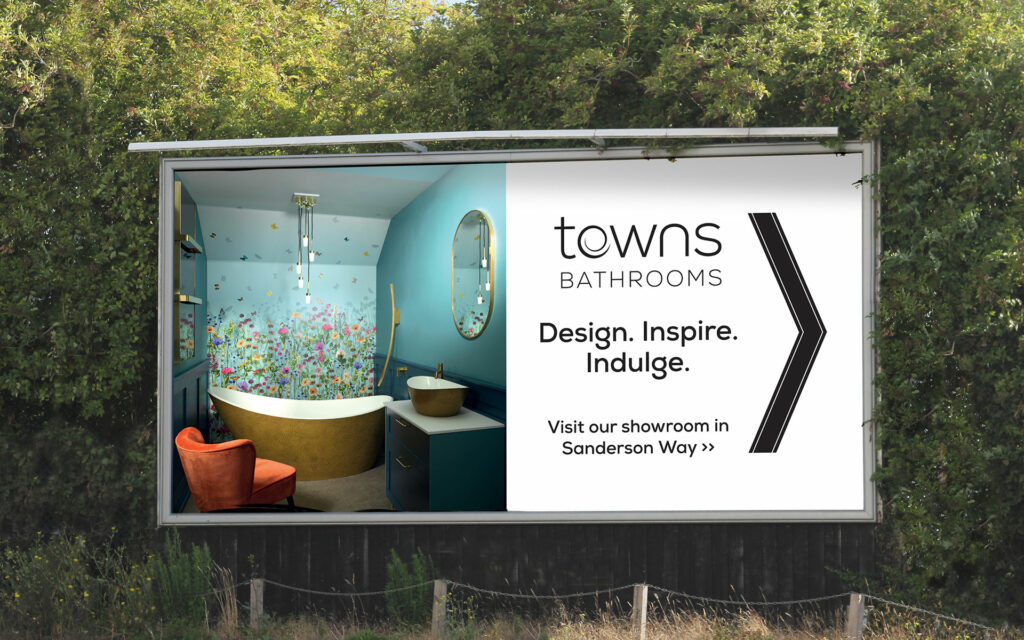
In contrast, the target audience for Towns Bathrooms are homeowners with an appreciation of luxury home furnishings and are located across a much wider geographical area. The marketing included a door drop leaflet campaign to carefully selected postcodes in the region, focussing on affluent areas and properties built during the past 20 years, which may require renovation. Towns also place regular ads in regional magazines and have a second billboard close to their showroom, featuring beautiful and impactful bathrooms. An ongoing social media presence promotes the showroom online.
Despite a challenging time during the pandemic, footfall and revenue for both the Plumbing Store and Bathroom showroom has increased during the past two years and the marketing campaigns have been instrumental in creating a better brand awareness. Towns have recently been challenged further by a new plumbing and bathroom store opening in the close vicinity, but the strong memorable designs of the billboard campaigns are allowing them to visually stand out from the local competition.