LJ Betts, a family-run salad farm in Kent, has a strong reputation in their market for being a knowledgeable and friendly supplier of premium quality salad. They wanted to update their branding to reflect their position within the market.
The Challenge
How to rebrand a family salad farm, without losing connection to almost a century of heritage.
Initially, the task was to update their outdated packaging to make it easier for customers to differentiate between their salad varieties on shelves and in boxes. However, it became evident that there was a significant amount of inconsistency within their branding, including multiple variations of the company name, typography layouts and colours within the logo.
Services
Strategy
Identity Design
Logo Design
Packaging
The Design Process
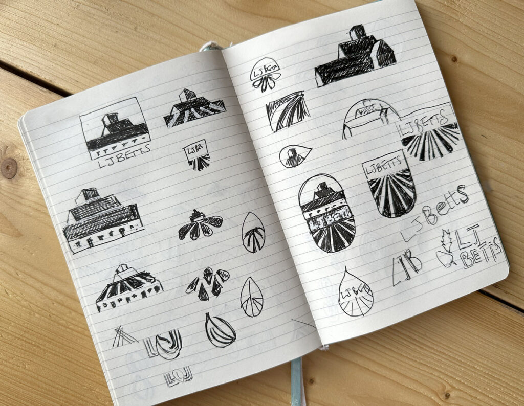
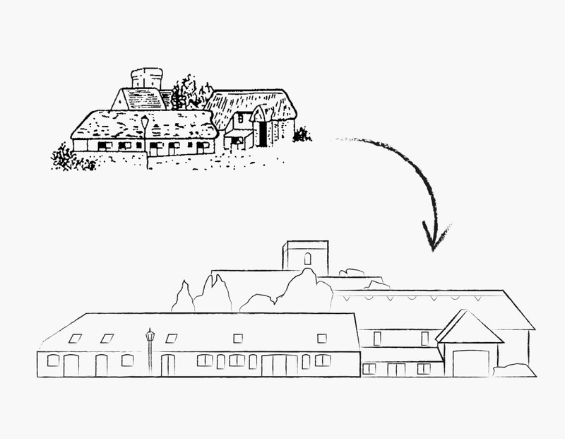
Whilst developing the LJ Betts brand, I explored evolving the existing logo and implementing a complete brand redesign. Knowing the significance of the farm buildings in the existing logo, I aimed to stay true to them whilst modernising the typography and illustration style.
I took the artistic license to redraw the buildings in a layout that balanced well with the new typography and I experimented with linotype and pen and ink as potential illustration styles. I also designed some contemporary logo options, drawing inspiration from salad leaves to create a graphic icon.
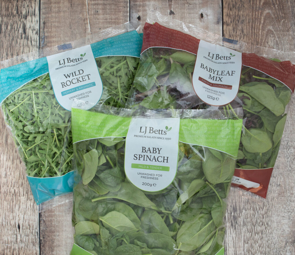
After researching salad packaging in the market, I presented various salad leaf pack designs. Two logos and packs were further developed, and a colour palette was selected for the core ranges.
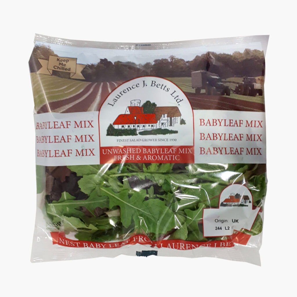
Before
After much consideration, LJ Betts decided to pursue a modern approach to their logo, opting for a contemporary salad leaf icon accompanied by traditional serifed typography.
This fusion of modern and traditional elements captures the essence of their brand evolution, while preserving their deep-rooted heritage.
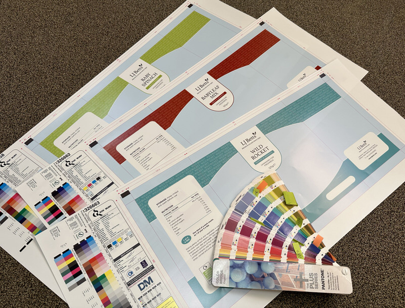
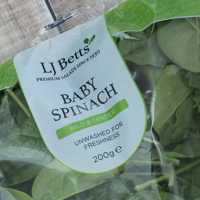
The salad pack designs are uncluttered, with all relevant information neatly held within a curved lozenge, allowing ample space for the leaves to remain visible. The colour palette provides distinction between the different varieties of salad.
Results
The contemporary new logo and packaging has modernised the family brand, whilst maintaining a connection to their heritage through the typography and strapline. The packs stand out on shelves giving them increased visibility.
The new branding has also been rolled out across the website, internal paperwork pack boxes, site signage and uniforms.
Phase One Design could not have made our rebranding project simpler! Not only was our brief understood, Fay set herself the task of truly understanding our products and the supply chain. This resulted in the creation of a wonderful new logo and packaging design that we could not have imagined. Fay was there to guide us at every stage of development and the process could not have been made simpler and, as a result, we are very happy customers!
Stephen J Betts, CEO, LJ Betts Ltd
We use cookies to ensure that we give you the best experience on our website. If you continue to use this site we will assume that you are happy with it.AcceptView our Privacy Policy